
Digital check in
Boarding pass
optimization
I leveraged AI eye-tracking software to efficiently design a page that would allow guests to download their boarding passes and reference personalized information to help them prepare for travel.
34%
projected increase of mobile boarding pass downloads
80%
projected reduction in exit rate


Overview
Increasing boarding pass downloads. Reducing exit rate.
Getting an email that online check in is open is exciting - the travel day is almost here! Not only does checking in online and save travellers time at the airport, it saves airlines a lot of money to check fewer guests in at the counter.
This project aimed to help more guests complete their check in flow online and is projected to increase mobile boarding pass downloads by 34%. In order to ship a solution within a two month timeline, I utilized AI eye tracking software to gain additional insights, guide design decisions and optimize my workflow.
Platform
Web app
Duration
Nov 2024 - Jan 2025
Role
UX/UI designer
Tools
Figma
The challenge
A 20 second API call. Short attention spans.
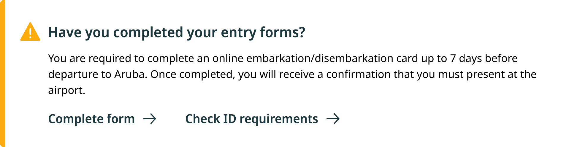
After downloading their boarding passes (A), guests are directed to a check in confirmation page with helpful day of travel information such as boarding times and immigration forms (B).
However, the API call between these two pages lasts 20 seconds, so 10% of users exit before seeing this information.
The primary goal of this project was to minimize the exit rate in the middle of the flow.

(A) Current state boarding pass delivery

(B) Current state check in confirmation
Additional background
Previous design exploration as a starting point
Attempting to address the 10% exit rate, another designer had previously designed a combination boarding pass and confirmation page. However, A/B testing of the other designer’s design vs. the existing design resulted in a 34% decrease in boarding pass downloads on mobile devices.
The secondary goal of this project was to discover why the earlier designs resulted in such a drastic decrease in completion rate and use those insights to guide my design process.

A previous attempt at combining boarding pass download and check in confirmation screens.

The solution
One fewer step in the flow
I had to find a way to reduce the number of users that exited the flow during the 20 second API call. The simple solution was to combine the boarding pass and confirmation pages, so that the API call would occur before boarding pass delivery, discouraging users from prematurely exiting the flow.
1. Merging two pages
I merged the previously separate "Boarding pass download" page and "Check in confirmation" page into a single page. While merging pages did not eliminate the lengthy API call, it shifted the order of information in the flow so that the API call occurred before guests receive boarding passes, discouraging users from prematurely exiting the flow.
This change alone is projected to decrease the flow exit rate by 80%.


The before

The after
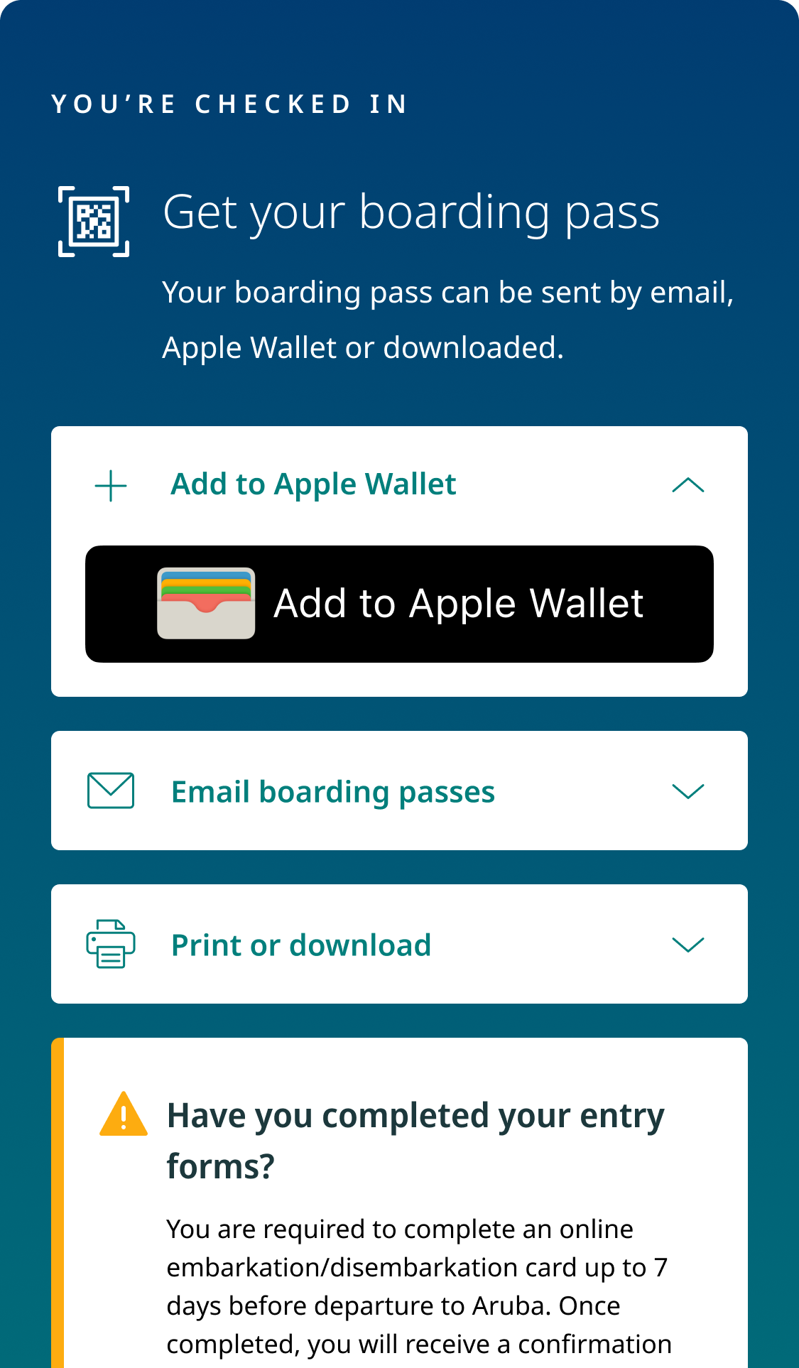
2. Quick access to Apple Wallet and email boarding passes
Data showed that Apple Wallet and email were overwhelmingly the most popular boarding pass delivery methods, with nearly 70% of guests choosing one of these two options.
In order to help guests access their boarding passes quickly, Apple Wallet sits at the top of the screen on iOS devices, and email sits at the top of the screen on desktop computers. Additional boarding pass delivery methods such as downloadable digital passes and printable passes are easily accessed in a collapsible UI.


The process
Understanding what’s been tried before
Another designer had previously designed a combination boarding pass and day-of-travel confirmation page, but it was never implemented after testing showed that the new design resulted in an 34% decrease in mobile boarding pass downloads. The testing revealed that users failed to download boarding passes, but not why they failed to do so, so I investigated it myself.
Seeing what the user sees
I had a hypothesis that 34% of guests failed to download boarding passes on their mobile devices because the white background of the boarding pass download UI filled the entire screen on a mobile device. As a result, boarding pass download options such as email or Apple Wallet fell below the fold and/or failed to visually stick out enough to draw attention.
Using AI eye tracking software, I produced a hot spot map that confirmed my suspicion. Users did not see the Apple Wallet download button, and they hardly noticed the digital pass and printable pass download options.

(A) An early design where guests failed to download boarding passes.

(B) Eye tracking showing where users’ attention is directed.
The process
Getting to know our users
Working with UX Research, I sought to more deeply understand the successes and failures of the current boarding pass delivery flow. We ran a test with 18 Canadian travellers between the ages of 27-57 that check in online when they travel. Participants completed check in with WestJet’s existing flow and answered questions related to:
Likes. dislikes, improvement opportunities
Likelihood to complete specific actions
Key takeaways include:
28% of participants failed to complete check in because they did not see the “complete check in button” which sits below the fold. (Image A)
78% of participants checking in on a desktop device prefer that the “email boarding passes” drawer be open by default. (Image A)
Guests want to see confirmation of their number of checked bags after completing check in.

(A) The current state boarding pass delivery page
We also pulled data on which boarding pass methods are most popular for WestJet guests (Image B). We found that Apple Wallet (37%) and email (30.8%) boarding pass delivery methods were overwhelmingly the most popular boarding pass delivery methods, with nearly 70% of guests choosing at least one of these two methods. For this reason, I decided to design a UI that prioritized Apple Wallet and email over other boarding pass delivery methods.
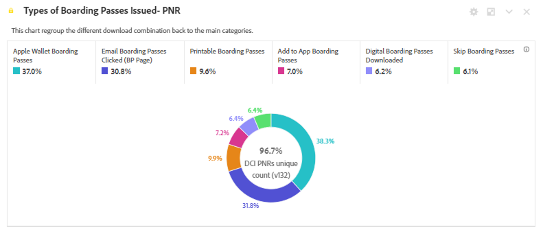
(B) Boarding pass delivery method preferences.
The process
Ideating again, and again, and again
Here’s a snapshot of solutions I explored that struck a balance between maximizing boarding pass downloads and ensuring that guests see important day of travel information:
Solution 1 - Boarding pass sheet
I designed an interface with a CTA that opens a sheet from which users can choose their boarding pass delivery method.
Strengths: The boarding pass delivery UI is short and sits above the fold, ensuring that the user sees there is more content lower on the page.
Weaknesses: Accessing boarding pass delivery requires one extra click and could result in fewer guests downloading their boarding passes.
The CTA to open the boarding pass sheet, the sheet, and and eye tracking map of where attention is directed.
Solution 2 - Prioritize popular delivery methods
In order to keep the UI vertically short, I designed a concept where the most popular boarding pass delivery methods - Apple Wallet and email - got their own collapsible, while the other boarding pass delivery methods were accessible in a sheet.
Strengths: Fewer visible choices results in less cognitive load.
Weaknesses: Download digital passes and download printable passes are more challenging to find, and the Apple Wallet button does not capture enough attention on the teal background.
The email and Apple Wallet boarding pass options, the sheet with additional boarding pass options, and and eye tracking map of where attention is directed.
Solution 3 - Collapsible UI
I designed a simple interface that places the existing boarding pass delivery UI inside of a collapsible at the top of the page.
Strengths: The boarding pass delivery UI is short and sits above the fold, ensuring that the user sees there is more content lower on the page. There is a minimal dev effort since no new components need to be developed.
Weaknesses: Accessing boarding pass delivery requires one extra click and could result in fewer guests downloading their boarding passes.
The collapsed boarding pass delivery UI, the expanded boarding pass delivery UI and and eye tracking map of where attention is directed.
The process
Usability testing
After presenting my work in progress concepts to the rest of the design team and receiving their feedback, I proceeded to test solutions 2 and 3. Working closely with user research, we ran a randomized ABCD test with 30 Canadian flyers who use online check in on a regular basis.
We tested:
Boarding pass download UI - Prioritizing popular boarding pass delivery methods vs. placing all boarding pass delivery methods in a collapsible.
Boarding pass UI placement - Should it sit at the top of the page of at the bottom of the page?
We asked guests:
To rank how prepared they felt for their trip.
To rank how easy downloading their boarding pass was.
Solution 3
Solution 2
Test results:
Boarding pass delivery method ease of use:
Solutions 2 and 3 tied for ease of use, with perfect 10/10 scores for both.
Boarding pass delivery method satisfaction:
Solution 2 came in first place (9.3/10) for ease of use followed closely by solution 3 (9.24/10).
Since solution 2 won by a margin, I decided to iterate on this boarding pass delivery method.
Boarding pass UI placement:
When boarding pass UI was located at the top of the screen, users downloaded their boarding passes and then scrolled to view content further down on the page. When boarding pass UI was placed at the bottom of the page, users rapid scrolled to the bottom and did not read the content on the page.
I decided to keep boarding pass UI at the top of the page.
The final result
Less is more - Creating clarity through simplicity


What’s next?
Looking to the future
In the future, we will explore adding additional guest-requested features such as flight status and baggage weight limits on this page. We will also conduct a full audit of the content on this page in order to determine what is valuable to our guests.
Thank you for reading!
Are you interested in working with me or just want to chat design?
Please visit my contact page and reach out!